FF Franziska In-Use:
rhizom Magazine

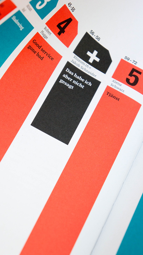
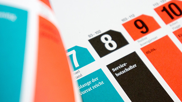
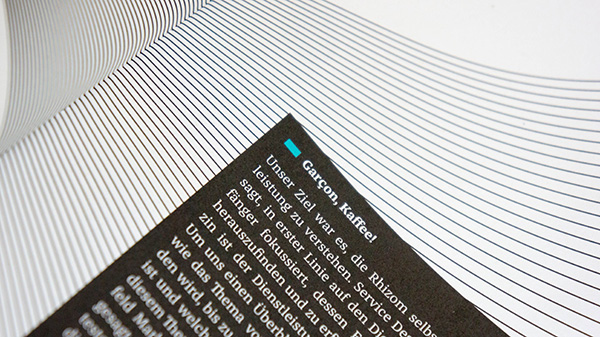
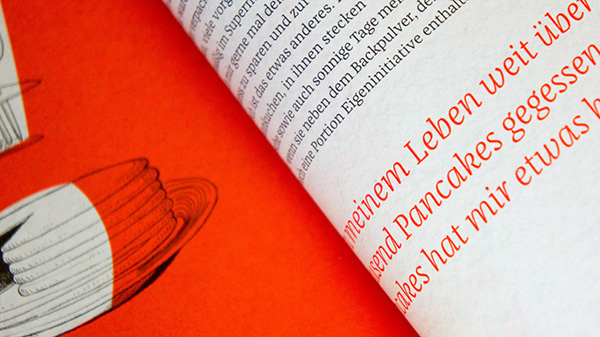
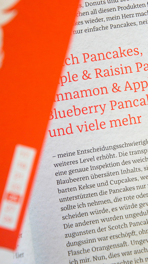
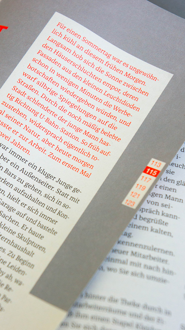
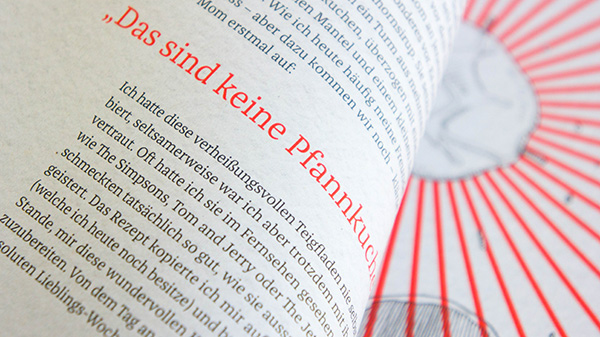
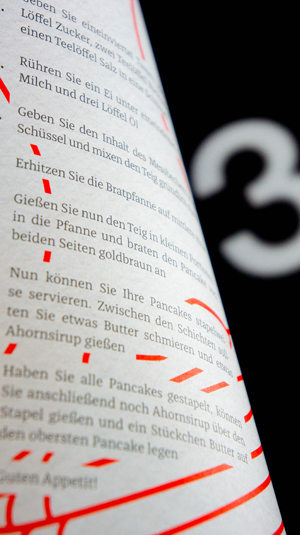
Rhizom is a student magazine project from the Department of Design at FH Münster and is a perfect example of Jakob Runge's FF Franziska in action. Throughout the project several of the widths available within the family are put into use, contributing towards the clear design layout and flow of the magazine.


About FF Franziska
Originating from Jakob Runge’s masters thesis at the Muthesius Academy of Fine Arts and Design in Kiel, FF Franziska was selected at the first public Typeboard of 2012 at TYPO Berlin. Planned as a slab&serif, a hybrid of sturdy slab and serif, its regular weight is built to sustain unfavourable circumstances, such as bad printing techniques or low resolution screens. The extreme weights of the family represent the two poles of FF Franziska: the quiet mono-linear and filigree Hairline feels like a pure slab serif, whilst the dark and substantial black weight comes with the contrast of a serif.
A diverse typeface, its extroverted italic differs itself from the roman by its playful shapes which can often be found in handwriting. With a wide range of shapes and moods the 20 style family is set to be an exceptionally useful typographic tool.


Check out Jakob Runge’s detailed insights into the making-of FF Franziska on fffranziska.com

